There 2 these images related issue which is common in many Blogger Templates -
1. The original size images get stretched beyond the space provided for the posts and mess with the sidebar Blogspot blogs.
 |
| The image is Stretched |
Occurs both in Desktop and Mobile devices.
2. The image gets distorted or the Image does not preserve its aspect ratio
 |
| Images aspect ration is not maintained in Mobile devices |
If the images are wider than the space provided, some themes deal with them casually. They automatically adjust the width. But the height stays the same as the height of the original image. It distorts the image, ignores the aspect ratio.
How to fix?
There is one simple solution that solves both the issues. Add this piece of code into the Blogger theme, and it will automatically fix the width and height fall the blog posts images of the entire blog
    .post-body img {
    max-width: 100%;
    height: auto
    }
Where max-width: 100%; adjusts the width. and height: auto fixes the height, and preserve the original aspect ratio.If you bit experienced, this would be enough. But if you inexperienced then follow these steps.
Steps to fix Blogger Posts Images Stretching out problem
1. Go to Blogger.com, select your blogger account and the Blogspot Blog you want to fix
2. Click on Theme > Customise

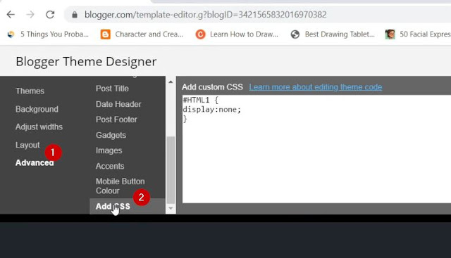
3. Under Blogger Theme Designer click on Advanced > Add CSS
4. Input the below CSS code into the section provided > Click on Apply to Blog
    .post-body img {
    max-width: 100%;
    height: auto
    }
Now refresh the post pages and it should be fine.
Here the above images got fixed both in Desktop and Mobile Devices


after used the code..all the image include ads also shrink. How to exclude resize the ads size?
ReplyDeleteThanks for sharing. Your blog is more informative. This is very nice article and very good information. We really enjoy your blog & content.
ReplyDeletegeeks to you melbourne